Series branding for paranormal romance book covers

Today I’m thinking about paranormal romance series’ book covers. Specifically, how the series’ covers achieve the following:

  1. make it clear it’s a paranormal romance novel!
  2. make it clear it’s a series
  3. have unique branding

I’m particularly interested in point (3) because there are so many very similar sounding series in this highly competitive market. How do you make your shifter romance series stand out from the eleventy billion other shifter romance series whilst still making it look like a shifter romance series?

For my extremely scientific investigation, I pulled up some series that popped up under “paranormal romance” in kindle books on Amazon. Then I decided to look specifically at shifter romance, to narrow down the genre into a subgenre, as it were.

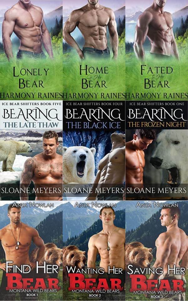
Well, apart from the fact that bear romance is a lot more popular than I had realised, the first thing that strikes me is unsurprising: a bare-chested man on the cover is fairly mandatory in the genre.

Bare-chested men abound in the bear-shifter romance subgenre (see what I did there)

Bare-chested men abound in the bear-shifter romance subgenre (see what I did there)

These are three different series by three different authors, but they’re all using the same devices to create a series brand: font, layout, and—in the case of the top and bottom series—background. The fonts also create different impressions; the middle series’ font/layout makes me think there’s a more fantastical flavour to the series (more fantastical than werebears), whilst the bottom series’ font gives a hint of western. (I have no idea if these suppositions actually match the contents. That’s a whole other experiment).

(I’m also starting to wonder just how many stock photographs there are of naked man chests…)

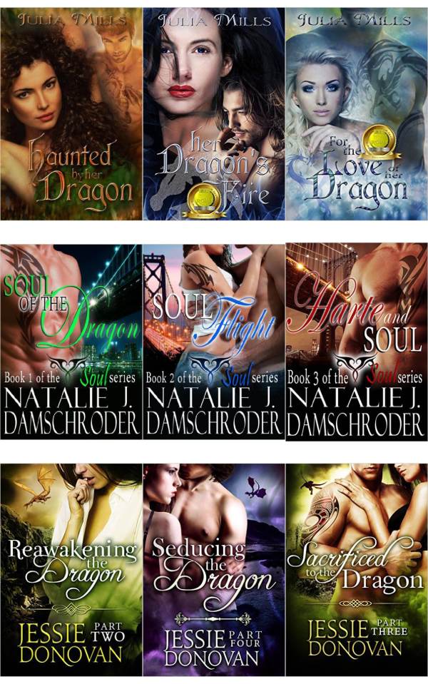
So onto dragon shifters.

Fantastical fonts!

Fantastical fonts! 

The dragon romances above also highlight another form of series branding I’ve noticed: colour tinting. I think this is partly why the bottom series looks more coherent as a brand than the top series.
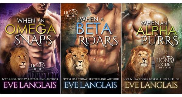
Tinted lion-y goodness! I like that the designer made the effort to find a different lion photo for each book.

Tinted lion-y goodness! I like that the designer made the effort to find a different lion photo for each book.

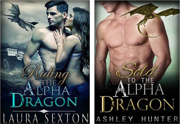
And I spotted this, by assuming it was the same series. A rather unfortunate coincidence in terms of creating unique series branding:

This is the must-have font for alpha dragons. Who knew?

This is the must-have font for alpha dragons. Who knew?

Conclusions? Nothing earth-shattering, but obviously the shifter romance cover design starter-kit includes:

  • a naked man chest
  • the animal your hero is shifting into
  • a distinctive font
  • tinting!

200 Covers / Editions of Pride and Prejudice

2013 marks the 200th anniversary of Pride and Prejudice‘s first publication. I, like many others, adore this novel. I love the romance, the humour, the social commentary, the satire… Every time I read it I take something new away. So in honour of this book’s 200th birthday, I have collected 200 different editions with 200 different covers. There are also graphs, because who doesn’t love a good infographic?

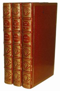
Thomas Egerton published the first edition of Pride and Prejudice in three hardcover volumes on 27 January 1813, with a second edition  published in November that year after the first sold out. The style of the first edition –relatively plain with some tasteful curlicues around the edges – is fairly typical of an old, casebound book.

1813 T Egerton First Edition

1813 T Egerton First Edition in three volumes

I haven’t managed to find many other editions from the 19th Century, but here they are:

Of the above, my favourite is the 1894 Peacock edition. Peacocks are used repeatedly on Pride and Prejudice covers, but in this case I think the first use is the best example. This brings me to my first infographic: the top ten elements shown on Pride and Prejudice covers.

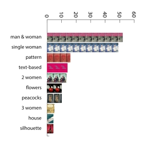
Top 10 Elements Featured on Pride and Prejudice Covers

Top 10 Pride and Prejudice Cover Elements

As you can see, a man and woman together is the top thing shown on Pride and Prejudice covers. Unsurprising, given its central romance plotline of Elizabeth and Darcy.

But let’s talk about the covers that aren’t on the above infographic – the one-of-a-kind covers, for better or worse. I give you:

My Pick of the Top 10 Oddest Pride and Prejudice Covers

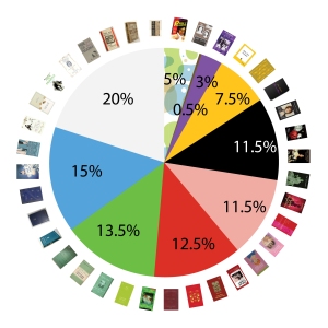
Also, because I do love my graphs, here’s a breakdown of 200 Pride and Prejudice covers by dominant colour:

Breakdown of Pride and Prejudice Covers by Dominant Colour

Breakdown of Pride and Prejudice Covers by Dominant ColourThis was a subjective judgement, and I tried pretty hard to categorise everything, but there were a few covers that I had to classify as ‘multicoloured’ despite my best efforts. As you can see, Pride and Prejudice covers come in pretty much every colour, with white being a popular but not majority choice.

OK, ready for the big finish? I give you 200 covers for Pride and Prejudice:

Printed Clothbound Hardbacks

I’m a big fan of hardbacks without dust jackets, and someone out there has been reading my mental memos lately. Over the last wee while, I’ve been seeing a few clothbound fantasy books with the design printed onto the cloth. The first of these was The Hobbit, which I coincidentally needed a copy of anyway. Witness its awesomeness:

This slideshow requires JavaScript.

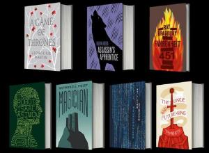
The second one I saw was Game of Thrones, which I was tempted by, but I already own it and there was no indication that the rest of the series would be published in matching covers. However, this discovery led to some googling whereby I discovered that this whole clothbound-fantasy-books-with-clean-cut-designs was a thing, a thing being done by Harper Voyager. Yay Harper Voyager! Continue!

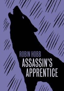
However, while I love the concept of printed-on-clothbound-covers hardbacks, I’m not so convinced by some of the actual designs. I love the one for The Hobbit, but I find the one for Assassin’s Apprentice extremely unappealing.

Assassin's Apprentice clothbound coverI don’t mind the design in and of itself, but it doesn’t fit the book. We’re talking about a gritty political intrigue/coming-of-age/quest pseudo-medieval fantasy here, right? With lots of pain and terror and wonder and magic? Admittedly, a wolf character is fairly central to the series, but howling in the purple rain?

And now I kinda want ALL the books.

harpervoyager clothbound

Hi there mysterious Cloak-person!

This slideshow requires JavaScript.


I see the cloak-hiding-the-face device used a lot, particularly on fantasy covers (although I could only think of 4 examples off the top of my head. Will add more as I find them). It leaves the reader free to imagine how the character(s) looks and gives a nice sense of ‘mystery’, but sometimes these mysterious-cloaked-figures-in-dark-menacing-shades blur together in my mind until they start to seem like the same one.

List of Default InDesign Fonts with Macrons

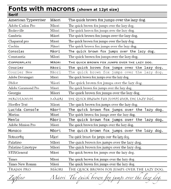
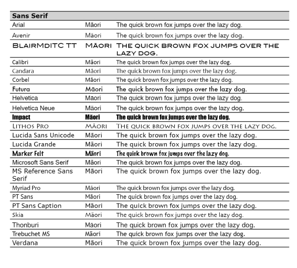
I have recently run into trouble with macrons. It seems that not all fonts have them in their range of characters, but they’re kind of essential if you’re using any Māori words. So I’ve put together a list of (probably) all the fonts that come with Adobe InDesign CS6 that have macrons available. I was hoping I would find such a list already existing on the internet, but it seems I shall have to be the one to put it there.

Without further ado, I give you macron madness:

Serif fonts with macrons

Sans-serif fonts with macronsMost of them, sadly, aren’t terribly useful for standard book typography. Probably the best of the lot are:

  • Adobe Garamond Pro
  • Adobe Minion Pro
  • Adobe Myriad Pro (sans serif)
  • Helvetica Neue (sans serif)

Do you want me to pirate your books?

Dear certain publishers,

Do you want me to pirate your books?

You might think this is a stupid question. By pirating your books instead of buying them, you and your authors don’t receive the money you would otherwise get from me. And you need that money to pay for things like editing and cover design and typesetting and authors who write wonderful but not terribly commercial books and all those other good things. So of course you don’t want me to pirate your books. Right?

Only, it’s starting to feel like you do. Quite often, when I set off to buy a particular ebook, I find that the ebook exists – hoorah! – but when I try to purchase it, I am told that this ebook is not available in my region. When this happens, I go to other ebooksellers and try to purchase the book from them in a format I can use (pdf, mobi, or a DRM-free version I can convert myself). I normally get the same answer – you cannot buy this ebook in New Zealand.

This presents something of a moral dilemma – I desperately want to read this book, but I don’t want to steal money from the author and publisher. I also don’t want to do anything illegal. But you’ve made it impossible for me to buy your ebook legitimately, while it is so so easy (and so so tempting) to acquire it illegally.

Now, I know about territorial rights, which make absolutely no sense for an electronic good distributed via the internet. Dividing up rights based on geography makes sense for print books, which require physical distribution, but ebooks cost the same amount – essentially nothing – to send to anywhere in the world.

So, in conclusion, please sort this out ASAP. I just want to buy your books.

Sincerely,

A New Zealand booklover

Bad English translations

I was recently in Vietnam for a couple of weeks. While I was impressed at how many signs had English translations, I couldn’t help but be amused by some of them. Below are just a few of the bad translations I saw.

The endearingly confusing life-jacket instructions:

'The inside of life jacket contains a small pocket with horn. Using this horn in case of emergency.'

‘The inside of life jacket contains a small pocket with horn. Using this horn in case of emergency.’

'Adjust hip padlock by pulling the padlock head excessive string.'

‘Adjust hip padlock by pulling the padlock head excessive string.’

The understandable, yet entirely incorrect, use of ‘and etc’ to describe the different materials used as canvas at a souvenir shop:

'Art of 100% net development of portraits on uneven surfaces of pebblestone, leaves, shell and etc.'

‘Art of 100% net development of portraits on uneven surfaces of pebblestone, leaves, shell and etc.’

The entirely incomprehensible explanation of Champa art in a museum, complete with typos:

'All the architectural works and altars with great dimensions displayed here have partly demonstrated the greatness of this relic and the artistic talent of Cham people. Charming and lithe statues of Tra Kieu dancing apsaras whic were expressed in a harmonious beauty a between appeurance and style have reached the high peak of plastic arts.'

‘All the architectural works and altars with great dimensions displayed here have partly demonstrated the greatness of this relic and the artistic talent of Cham people. Charming and lithe statues of Tra Kieu dancing apsaras which were expressed in a harmonious beauty a between appeurance and style have reached the high peak of plastic arts.’

Astonishingly bad cover poses

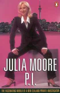
I discovered this gem at the library today:

julia_moore_piEverything about this pose/layout is designed to draw your attention to a rather unfortunate area. I particularly love the focal shadow in the centre.


On Semicolons

Semicolons are my favourite punctuation mark, but that wasn’t always the case. For years I struggled with them, unsure when and where to use them. There were times when a sentence would cry out for a semicolon, and unable to ignore its plea I would furtively sneak one in, hoping no one would witness my punctuation crime.

I believed that semicolons were so complicated that they required advanced training. Five years of high school English and a lifetime of reading had failed to instil me with the requisite knowledge. In desperation, I turned to the option of last resort: the internet. Half an hour later, I was fully armed and ready to fire my first ever confidently-placed semicolon.

Today, the thought of being without my semicolon friend horrifies me. The semicolon is a thing of beauty, a point of perfect balance around which two closely related independent clauses can revolve. The semicolon brings order and clarity to lists overly loaded with commas. The semicolon is subtler than the blunt period, more assertive than the timid comma, and more dignified than the common dash. The power of the semicolon is best used frugally; in large doses semicolons overwhelm. Lightly sprinkled where appropriate, there is no punctuation more satisfying than a well-placed semicolon.

On book burning

A little while ago I encountered a book so terrible that in my review of it I said that I wanted to set it on fire. I meant it figuratively, of course, but I didn’t anticipate my friends’ enthusiasm for turning my hyperbole into reality. ‘Why don’t we have a ceremonial burning?’ they suggested.
The idea made me deeply uneasy. Admittedly, when I imagined flames licking up around the pages of this particular book, a deep sense of satisfaction filled me. I felt that burning my copy would be a form of catharsis, allowing me to be rid of all the negative emotions I associated with it.
And yet…
Book burning doesn’t get much positive press, and for good reason. Burning books is a symbolic act heavily associated with censorship and oppression. Through book burning, many irreplaceable texts have been lost. A tiny part of me wanted to argue that since my book burning would be a personal form of venting rather than any kind of political statement, it didn’t matter what the negative connotations associated with the act were.
However, after mulling it over I have decided not to burn my copy of this particular book. I value freedom of speech very highly, and that includes the freedom of other people to write things that I entirely disagree with. Although I detest this book, I would never argue that it should be banned. And that’s what burning it would imply – it would be arrogant to think I could avoid that interpretation.
A friend also pointed out that since I scribbled furious rants notes all over my copy of the book, it’s now a one-of-a-kind object, and ought to be preserved on the grounds of uniqueness. I also like to think that my annotations – me expressing my freedom of speech – will act as a powerful counterargument to the typeset words on the page.

  • Blog posts